Wouver Refactoring — Professional UI/UX Improvements
A deep dive into the complete UI/UX redesign of the Wouver platform: new design system, modern components, animations, and production-ready quality.
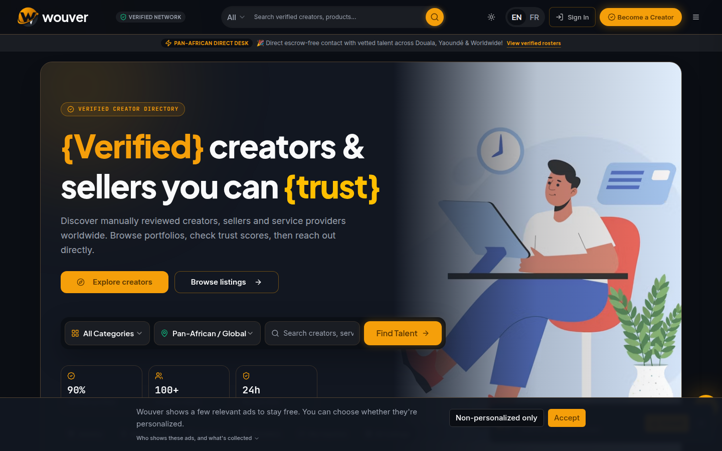
We're thrilled to announce a major UI/UX overhaul of the Wouver platform. Every core component has been redesigned from the ground up to deliver a modern, polished, and professional experience across all devices.
✨ Key Enhancements Overview
This refactoring touched the entire visual layer of the application — from the authentication modals to product cards, navigation, and the global design system.
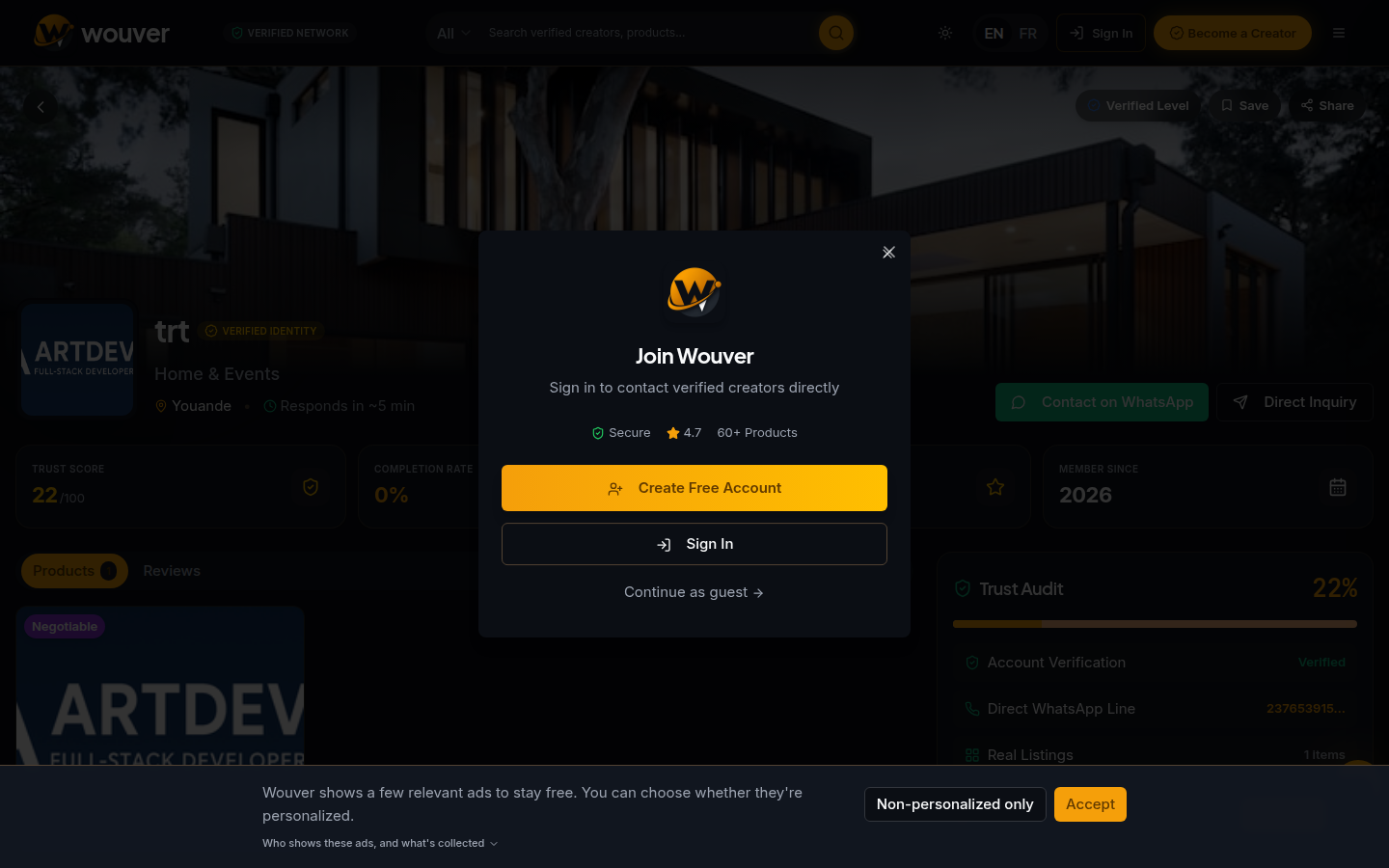
🎯 AuthPromptModal — From Basic to Stunning
The authentication prompt was completely reimagined:
Before: A simple modal with a basic layout, a yellow/gold color scheme, limited visual appeal, and basic button styling.
After:
✓ Glassmorphism effects
✓ Staggered animations
✓ Multi-language support
✓ Professional typography
✓ Better visual hierarchy
✓ Touch-friendly mobile layout
✓ Dark mode support
📱 Header — Elevated Navigation
The header received a complete styling upgrade:
210 85% 48% for a modern, professional look with enhanced contrast.🛍️ ProductCard — Modern Card Design
Product cards were modernized with:
🎨 Global Design System
Color Palette
| Token | Light Mode | Dark Mode |
|-------|-----------|-----------|
| Primary | #1E90FF (Modern Blue) | #5AC8FF (Bright Blue) |
| Accent | #FFD700 (Gold) | #FFD700 (Gold) |
| Background | #FFFFFF | #0F1419 (Dark Blue) |
| Foreground | #1E2535 | #F0F0F5 |
Typography System
Spacing System
xs: 4px   (0.25rem)
sm: 8px   (0.5rem)
md: 12px  (0.75rem)
lg: 16px  (1rem)
🎭 Animation System
We implemented a comprehensive animation system:
Easing Functions
ease-out — Entry animations (0.4s)cubic-bezier(0.4, 0, 0.2, 1) — Standard transitionscubic-bezier(0.34, 1.56, 0.64, 1) — Bounce effects📊 Responsive Breakpoints
Mobile:   < 640px
Tablet:   640px – 1023px
Desktop:  1024px – 1919px
Wide:     ≥ 1920px
All components tested and optimized across every breakpoint.
✅ Quality Improvements
Code Quality
Performance
Accessibility
🚀 Build Status
✅ Production Build Successful
📁 Files Modified
Core Components
AuthPromptModal.tsx — Complete redesignHeader.tsx — Enhanced stylingProductCard.tsx — Modernized designStyling
index.css — Updated color schemeApp.css — Professional CSS overhaul🌟 What Makes This Professional
What's Next
The platform is now production-ready with professional-grade UI/UX standards. Stay tuned for more updates as we continue to refine and expand the Wouver experience.
Visit wouver.com to experience the new design firsthand.
"Great design is invisible. It just works." — Wouver Design Philosophy
Ready to monetize this skill? Join Wouver →
Comments
Comments are coming soon. Join the conversation on our platform.
Related Articles
Wouver Platform Update: What's New in March 2026
Explore the latest features, improvements, and roadmap updates for the Wouver platform.
Introducing Wouver: A Verified Creator Directory Built on Trust
What Wouver actually is: a bilingual directory of verified creators, sellers, and service providers — with a real, computed Trust Score and zero commission on every deal.